

Cheers


It is pure fiction.Spiraluk wrote:Can anyone tell me if this Grenadier is valid for the GNW and if so what regiment he's from?
Not much is known about grenadier caps because they were not officially issued in the Swedish army. Grenadiers either got a tricorne or a karpus when new uniforms were issued to a regiment. Any colonel who wanted grenadier caps had to contact a private manufacturer and pay for this with his own money. The few surving caps and written descriptions of others show a great deal of variation of the design, as you would expect when there is no regulation.turrabear wrote:as far as i'm aware and there is a bt of a debate on this swedish grenadiers in the g.n.w didn't wear the mitre cap in the field. they wore a tricorne. as i said there is a debate about this and i could well be wrong.
as i said it is a debatable point . can't find any evidance to say they were worn in the field. but that dosn't mean that they wern'tTacitus wrote:Not much is known about grenadier caps because they were not officially issued in the Swedish army. Grenadiers either got a tricorne or a karpus when new uniforms were issued to a regiment. Any colonel who wanted grenadier caps had to contact a private manufacturer and pay for this with his own money. The few surving caps and written descriptions of others show a great deal of variation of the design, as you would expect when there is no regulation.turrabear wrote:as far as i'm aware and there is a bt of a debate on this swedish grenadiers in the g.n.w didn't wear the mitre cap in the field. they wore a tricorne. as i said there is a debate about this and i could well be wrong.
The idea of them not wearing the caps in the field is just speculation. The little information that is available from the 18th century suggest that the government was not at all hostile to the use of grenadier caps. They just thought it was too expensive.
Yes, but what I wanted to point out is that the whole discussion is rather meaningless considering how little information we have about Swedish grenadier caps.turrabear wrote:as i said it is a debatable point . can't find any evidance to say they were worn in the field. but that dosn't mean that they wern't


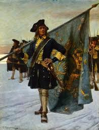
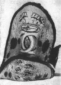
Göte Göransson's illustrations are true classics! They are however not without issues and that particular picture got the colouring wrong.lewenhaupt wrote: Adding this picture of a Swedish Grenadier mitre. This one illustrates a mitre in Russian keep, taken during the GNW. So it gives evidence to the usage of soft miters, as opposed to the hard brass front plates.


